In the beginning....
Katy was raised on Ynys Mon and moved away in later life, with the island staying as a special place for her. It’s where her husband Robert and her bring their kids for holidays and come to see family, so it made perfect sense for them to buy 16 Church Street, an existing holiday home, full of character in the heart of Beaumaris. They asked us, Mairead and Co Interiors, to do the Interior Design and it turned into an interiors adventure, a labour of love and even if I do say so myself, a gem in our portfolio. Boltholes and Hideaways kindly asked me to write a blog about the journey of The Papered House so here it is… Hold onto your hard hats…
“Where there is no vision there is no hope” George Washington Carver
Well I’m not sure I’d put it as strongly as George but he’s onto something. The first thing we did was establish the agreed look. Katy and Roberts' dream renovation included a total overhaul internally and externally and a new light-filled side extension for hosting, entertaining and providing great family time for them and for the homes' potential holidaying guests. We created a vision document with three case studies of different established successful operations we all liked in the hospitality industry, drawing from a hotel, a holiday home and a furniture brand.
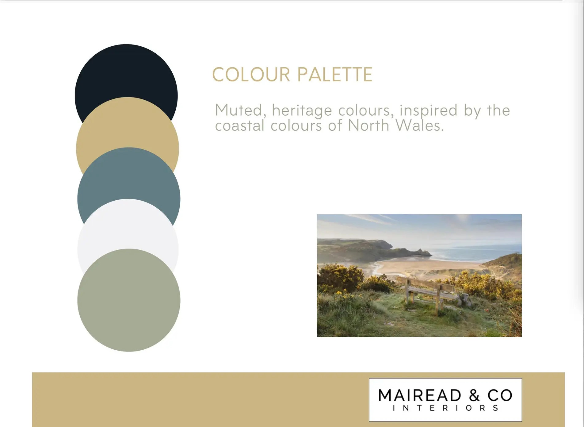
Once we’d honed the agreed look and chosen our five colours for the house palette I got on with the designing. Sometimes clients don’t want to do this phase but conversely it’s probably the most important phase to ensure the success of the project. It’s at this point I was phoning Boltholes and Hideaways and testing ideas out about how many bathrooms we needed and bed configurations based on this research. When you’re spending a lot of money, time and effort the strength is going to come from a laser clear vision of what you are creating. A blurred vision will need correcting. Somebody needs to be able to see it and articulate it or no-one else will.
What’s authentic anyway?
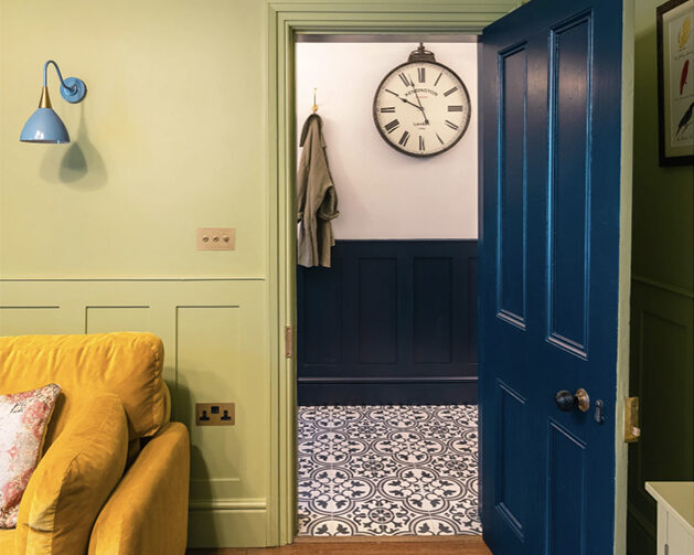
We really wanted to celebrate and accentuate all the Victorian features but it’s not an exact science working out how much to put in, what to restore and what to take out. Buildings of this age (1860) have often had features removed and added as they've evolved and 16 Church Street was no exception with the building being used as a shop and latterly a dental surgery before being converted to a house, so it had an odd arrangement downstairs with two front doors, one going straight into the reception room and a WC knocked out of the reception room making a somewhat stunted space and an odd dining room behind the small kitchen.
Working with the architect we all decided to make the snug as big as possible by restoring its original footprint, removing the WC and two of the three doors into it and making a generous utility room, pantry and WC out of the existing dining room.
I asked Architect Adrian Williamson, to take me through all the existing features to make sense of the buildings’ history to help me rationalise decisions. We decided to put in panelling throughout the older rooms. Panelling has been particularly on trend, although of course it's a time honoured detail and looks brilliant as it can enable quite bold wallpaper to feel more balanced if you are a wallpaper fan. We researched panelling which would feel in proportion to the existing details in the door cornicing and the age of the property.
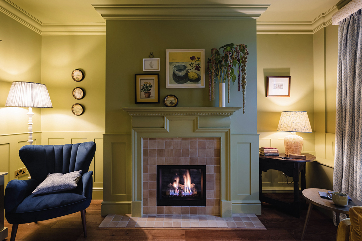
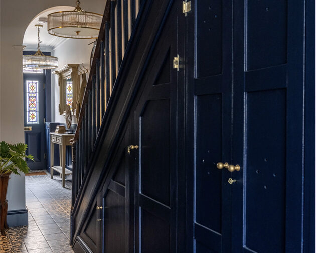
We restored all the fireplaces, sourcing old fires surrounds from Original Fires in Ruthin where needed, we swapped the existing fire surround from the new master into a smaller bedroom as it seemed out of proportion. Robert wanted a stained glass door so we commissioned panels from K G Bell in the Wirral which was a nerve wracking measure. There was a lovely 4 hole motif used on the original cabinetry under the stairs which were restored and this 4 hole motif was mimicked throughout the house.
Repetition can be a big reassuring hug.
One joy of designing a whole house is that we could use the same five colours throughout in different variations, from this basis we then found materials and motifs that we also wanted to repeat.
These were used externally and internally. When you keep repeating colours, materials and motifs it feels reassuring like a big hug or that predictable kiss at the end of the rom com.
I loved the rustic style tiles that we used throughout the house in the splash backs in the kitchen and utility room, the fireplaces and the outside dog shower. These tiles were matched to our house palette. Two colour ways of these tiles were used in 8 different places.
A few of the design choices explained
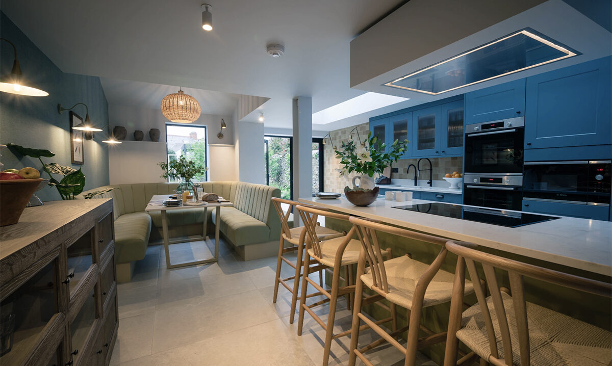
Katy and Robert wanted the kitchen diner to have loads of light and this modern extension with black steel doors and a roof light was going to be very different in feel to the rest of the house so I treated it quite differently stylistically. Putting in bronze hardware, rather than the more traditional brass used elsewhere, and a more pared-back, light aesthetic. I felt the modern extension should relate to the rest of the house - cue repetition of colours and materials - but have a different feel.
This kitchen-diner is the link to the garden which is so beautiful it is really the star act so we tried to make the space quieter than the older parts of the house. Like that perfect host that calms, flatters and enquires softly as to how you are. I cannot lie, this was a challenge, and I did waiver and considered some rather fabulously showy off wallpaper but dug deep and found my inner restraint (and textured linen wallpaper).
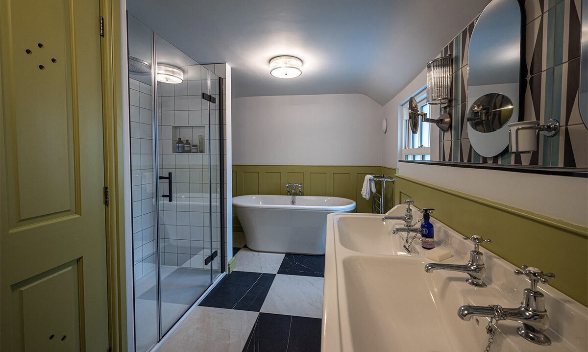
We wanted the bathrooms to feel glamorous and traditional so put free-standing baths in them and double sink units with all the styling of a luxury hotel. They were big spaces so we worked hard to warm them up with painted panelling and busy floor tiles.
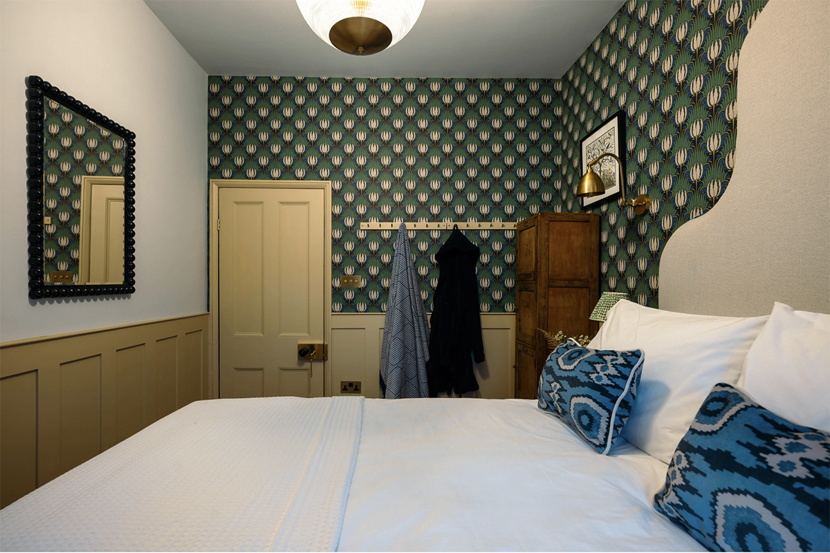
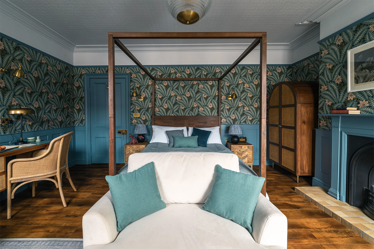
We kept the bedrooms full of character, really wanting the sash windows and the lovely reveals to be admired so taking the curtains and voiles as far away as possible so you can see the whole window or cosy everything up with loads of fabric. The bedrooms are really a celebration of being a guest in The Papered House, all the wallpapers are botanical and joyful, inviting you to sink into a big cosy bed and soak up the lovely pattern.
Throughout the house we added in vintage pieces to keep it feeling personal and unique. I love vintage pieces but they are hard to plan for far in advance - to find the right look and proportions can be tricky at the right time. eBay and Vinteriors are great for sourcing pieces and we did use both. As a rule of thumb I wanted to get at least one vintage piece of furniture in each room (apart from the more modern kitchen-diner). The majority of the vintage pieces are from Hawthorn Yard in Menai Bridge.
Because the clients were very trusting I was able to buy pieces as I saw them, knowing what would work and Hawthorn Yard took a brilliantly flexible approach (I may still have stuff to return to them in my boot). One of my favourite buys from them was about 100 vintage books which seem to have made it into every room, these books were from a local private collection and, like the locker from Holyhead High School that is also in the house, its lovely to rehouse local artefacts for others to enjoy.
It’s always about the people.
This was a rare job where we were blessed with a lot of trust from the clients, Katy and Robert who appointed us to deliver a whole turnkey package. They wanted to walk into a finished house with minimal everyday input, meaning we designed and ordered everything from the flooring to the kitchens, to every light fitting and light bulb... there were a lot of light bulbs….Katy and Robert looked forward to receiving their schemes and were excited about the future transformation. I really enjoyed this about their approach. Once enthused about the schemes they left the contractor, and us, to deal with the nitty gritty details.
We recommended the architecture firm, WM Design, and two excellent contractors to choose between with Glas Projects being appointed. We have completed two other projects with Glas Projects so felt confident working with them. They achieve a beautiful finish using skilled tradesmen and we learnt a lot about decorating, carpentry, tiling, plumbing, electrics and more from Sion and everyone there. We also undertook our first garden design by bringing the talented and green fingered Laura Woods and designer Ian Longford on board.
Book your stay at The Papered House here.
Mairead & Co Interiors deliver interior design services across North Wales and the UK, explore more here.

